Rebrand & Website Design — Synched Events
After 10 years under The Little Lending Company, Penny felt disconnected from her name and wanted to rebrand to better embody her unique offerings, distinctive style and expertise. After sitting on the name ‘Synched’ for some time, Penny got in touch with Studio Florere to discuss moving in a new, more elevated direction.
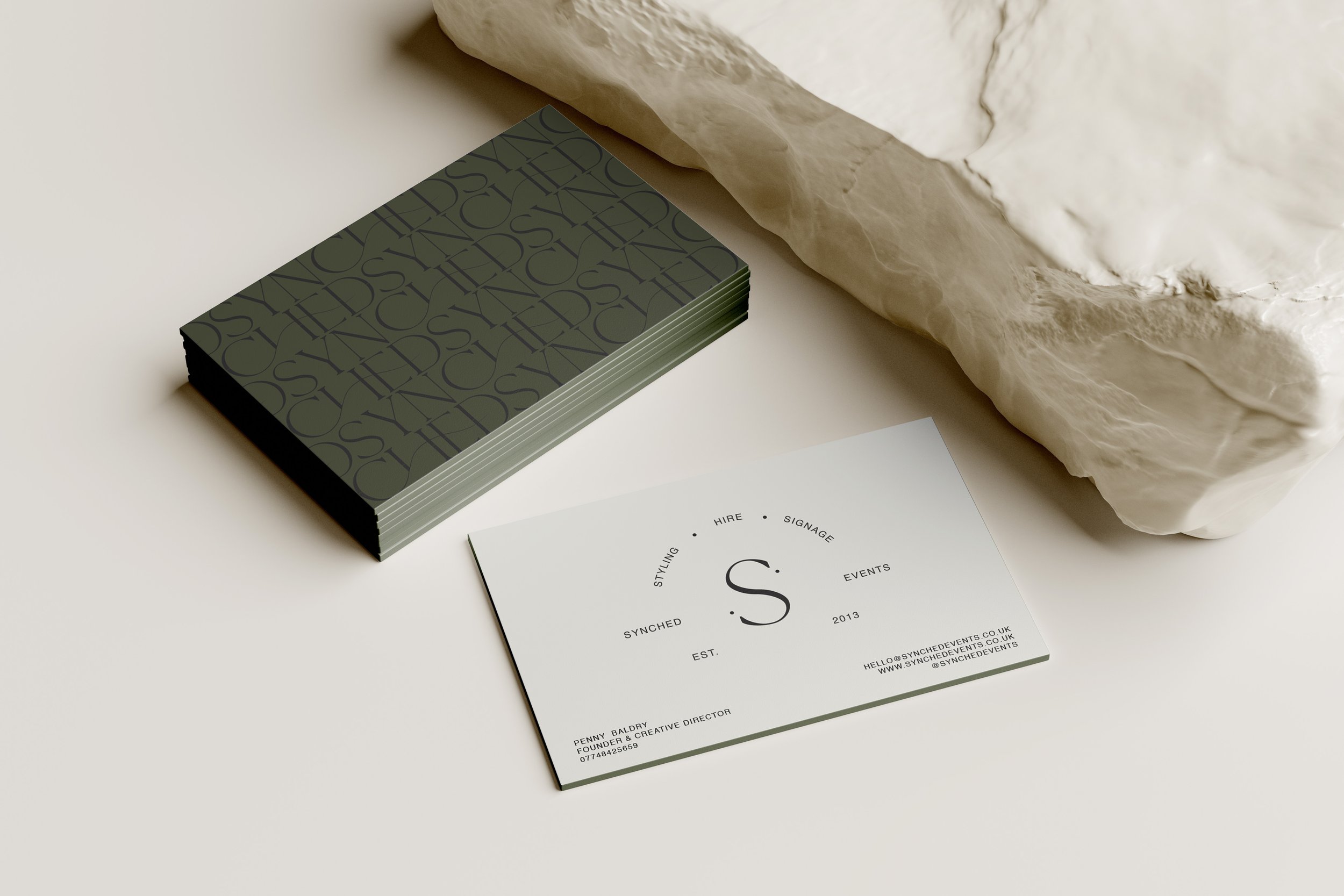
With a brand strategy in place underpinning her value, creative direction for her new look encompassing all she wanted to convey to her target audience, I set to work on developing her new brand identity that was sophisticated, timeless, bold, stylish and minimal.
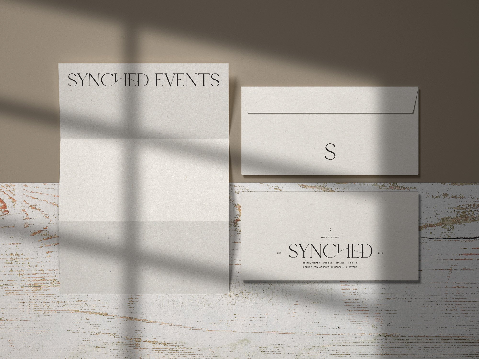
I came up with a logo suite that used both bold customised serif and timeless sans serif typography and an earthy, monochromatic and dirty olive colour palette.
Signifying the very meaning of the word ‘synched’, I created fluid movement throughout the word ‘SYNCHED’ and added in two dots to her brand mark representing two individuals, one couple and where SYNCHED connects the two. Alongside these signifiers, I included her established date to pinpoint her time in the industry to showcase her expertise.
Penny’s new brand identity has enabled her to feel reinvigorated with her brand and harnessed her vision for the future.


